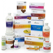
The new look of Isagenix is more than a makeover. We’ve created a simple, easy-to-understand design with our brand front and center, benefits that pop and many other features to give you what you need to share Isagenix with the world.
“The objective behind the new design is to have a line of products that look dynamic in representing the balance between science and nature, as it will be the look of Isagenix for years to come,” says Adri Lynch, Chief Marketing Officer at Isagenix. “There is strategic thinking behind every element. Our goal is to make it easy for you to share Isagenix.”
The intention behind the new look was to create a clean, cohesive design. Another major goal behind the fresh packaging design was communicating simply and effectively. Since 2002, in terms of packaging, Isagenix has come a long way. The new packaging is a tool to start conversations and spur fresh interest. The first of these packages will start rolling out at our annual 2014 Celebration event and will continue globally this year, and steadily follow in 2015 as current inventory of each item depletes.
Some of the highlights of our new packaging include:
- Isagenix brand front and center
- Product benefits clearly spelled out on the front panel, with details on the side panel
- Nutritional information in a clean, new layout
- Dietary icons for each of our products (gluten-free, soy-free, vegetarian, kosher) or the “Cheerful Cows” icon showing that our cows have not been treated with hormones or routine antibiotics
“The Isagenix vision is to impact world health and free people from physical and financial pain, and in the process, create the largest health and wellness company in the world,” says Adri. “Our packaging and everything we do is a reflection of this vision and core to the values that make Isagenix different from any other health and wellness company in the world.”


